
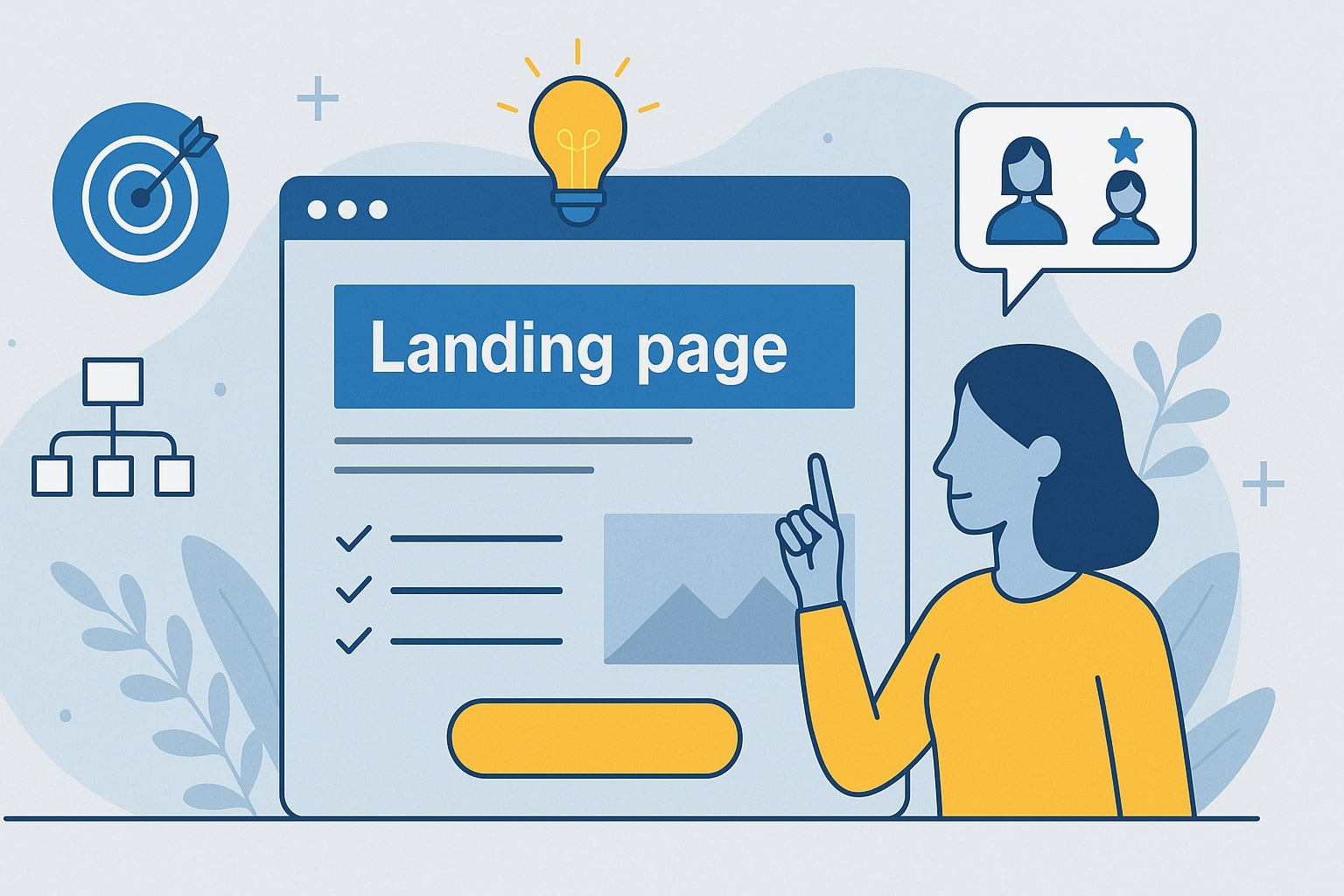
Creating an effective landing page is not simply a matter of choosing an attractive design and writing a couple of compelling sentences. Behind a good landing page lies intent, structure, and a deep understanding of the user.
In a digital environment where every click counts, knowing how to create a landing page that genuinely works can be the differentiating factor between capturing a lead or losing it forever.
At Doowebs we work daily with businesses seeking to improve their digital presence, capture more contacts, or increase their online sales. And experience has shown us that, although every sector is different, the foundations for how to create an effective landing page are universal.
This article will serve as a practical guide, with sector-specific examples and advanced tips that you can apply from today.
What is a landing page for?
Before getting technical, it is worth clarifying what the real purpose of these pages is.
A landing page serves to direct the user’s attention towards a specific action, without distractions. That is, to make them click where you want: leave their details, make a purchase, download a resource, request a demo, or sign up for an event.
This is why, when someone asks what landing pages are for, the answer always depends on the objective of the campaign or marketing strategy. But they all share one thing: they are designed to convert.
Unlike a traditional services or homepage, a landing page does not aim to inform about everything, but to convince about one single thing.
How to create a landing page: the guide that actually works
Below you will find the process for understanding how to build a good landing page step by step. No magic formulas — only techniques that work and that we apply in real projects.
1. Define a single, measurable objective
Every landing page must respond to a single intent. If you try to sell, inform, and capture leads simultaneously, the user will not know what to do. Before moving on to more practical content, it is important to structure that initial strategic decision very carefully.
Key tips:
- Choose a measurable objective: “increase requests by 20%”, “capture 200 leads per month”, etc.
- Avoid generic copy. A user will not act if they do not understand what they stand to gain.
- Adapt the design to the objective: not all landing pages require the same approach.
2. Structure the content with reading logic in mind
80% of users scroll quickly before reading, according to a Nielsen Norman Group study. This means you must visually orient the content so that the main message is understood even without reading in depth.
This is where many fail: writing well is not enough — you also need to organise well.
Essential elements:
- Clear headline explaining what you offer.
- Subheading that reinforces the benefit.
- Visual block or video that makes it easy to understand.
- List of benefits (not features).
- Social proof: testimonials or real case studies.
- Powerful and visible CTA.
A professional recommendation: dedicate twice as much time to the headline as to the rest of the copy. It is the first thing that shapes the user’s decision.
3. Design to convert, not to decorate
A common mistake is attempting to create an attractive landing page solely from a visual standpoint. But design must be subordinated to conversion. In web design, less is more… especially on a landing page.
Best practices:
- Ample white space — do not be afraid of it.
- CTA always visible without scrolling (where possible).
- Contrasting colours that guide the eye.
- Avoid excessive menus: they distract.
- Impeccable mobile usability.
At Doowebs we regularly conduct A/B tests comparing different layouts. As expected, simpler designs tend to win.
4. Apply action-oriented copywriting
Copy is the engine of conversion. And yes, what you say matters more than you might imagine. This is where you truly learn how to create a good landing page for your business. Even if two landing pages share the same design, strong copy can make them perform entirely differently.
Recommendations:
- Talk about what the user gains, not about what you do.
- Use short, direct sentences.
- Anticipate objections (“no commitment”, “easy cancellation”, “delivery within 24h”).
- Prioritise action verbs: download, request, access, get started…
No unnecessary technical jargon. If the user has to think too hard, they will leave.
5. Include validation and social proof
Online testimonials are becoming increasingly important, almost on a par with personal recommendations. If you want to know how to create a landing page that converts, this section is non-negotiable.
Bear this in mind: your word will always carry less weight than the word of your clients.
Ideas that work:
- Real, verified reviews.
- Number of clients or completed projects.
- Logos of brands you have worked with.
- Trust badges (SSL, secure payment methods, etc.).
Sector-specific examples to inspire you
Here are some ideas applied to different sectors, based on real projects and well-established trends.
Landing page for a law firm
Before going further, this type of landing page works best when clarity takes precedence over design.
Key elements:
- A direct headline (“Claim your compensation in less than 48 hours”).
- Very concise forms.
- Testimonials from successful cases.
- CTA oriented towards a free consultation.
Landing page for e-commerce
A small tip: e-commerce landing pages must reduce the fear of purchasing.
Key points:
- Highly detailed photographs.
- Comparisons with other products.
- Visible guarantees.
- Purchase button always pinned on mobile devices.
Landing page for B2B services
On these pages, the conversion process tends to be longer and more rational for potential clients.
Tips:
- Offer a downloadable resource (PDF, checklist, guide).
- Explain the onboarding process.
- Showcase measurable results achieved with other clients.
- Personalised call as the final CTA.
Advanced optimisation: what only the businesses that truly convert apply
We move now to the next level. If you already know how to create an effective landing page, this will help you get the most out of it.
Continuous A/B testing
If something is not working, we need to know what to change; if something is working, it can almost certainly be improved further. Nothing improves without testing.
Test:
- Headlines
- Button colours
- Form length
- Images
Optimisation based on real user behaviour
Understanding the user is essential for refining the details. Use heatmaps and recordings (Hotjar, Microsoft Clarity). This will allow you to see:
- At what point they abandon.
- Which elements they ignore.
- How they navigate.
Loading speed
According to Google, a 1-second delay in loading time can reduce conversions by 20%. Optimise images, code, and hosting.
Doowebs, for example, works with server configurations designed to improve speed on corporate websites and e-commerce stores.
Short forms
Unless strictly necessary, request only essential data. The conversion rate will always be higher the easier a form is to complete.
Landing pages are not ordinary pages: they are strategic tools that require intent, clarity, and careful design. Knowing how to create a landing page means understanding the user and speaking to them directly, without detours and without visual noise.
If you need help creating a good landing page for your business, optimising the ones you already have, or launching campaigns with dedicated pages, at Doowebs we can support you with a professional, measurable, and results-focused approach.
Would you like us to review or design your landing page? Contact us and let us get started today.